


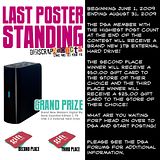


I'm trying to do my own background etc, it looks just fine from my screen .... how do you see it, please let me know???? The first person who can help me to get my blog right (in everyone's eyes, lol) gets one of my kits (their choice) for free :) and just a little note ... I have a new kit coming out on 1st November :)
Thank you for your imput, I have removed the decorative side bars and changed the paper now ..... how does it look on your screen???
Ok.... now I have made the background paper bigger, does it fit??? It has always fitted my screen which is 19"
So what about this then, I only see the left hand side decoration???? What do you see ????
Now we're back to the plain background .... maybe I should just pay someone to do this for me, lol
Subscribe to:
Post Comments (Atom)

13 comments:
It looks good, but the center area is not really centered - you can hardly see the right edge design, but that could just be my computer screen. Otherwise, it looks nice. I need to learn how to do that so I can dress up my blog.
Looks good on my little screen. I do however find the tiny brown print used for the dates difficult to read. I think the font is fine, the color could perhaps be a bit darker.
Betty
I see a Pretty Dark Blue Background But the font is hard to see. If the font was lighter that would probably help.
Well I wasn't sucessful deleting my last coment so here is a revised version
Ok now I see the Pretty BG I saw last night That light Brown is Gorgous! The Text should be darker so it is easier to read. My arms are only so long so it would be nice if the text was bigger. he he he
On to the whole thing. on my wide screen page is coming up on the left and blogger blue on the right. I bet you can steal some HTML formatting from one of those templates they give you to straighten this out I would assume you need a layer in a complimenting color to go under you Background to fill in the gap.
Good Luck
Diana
On a partial screen, it looks absolutely perfect, but when I go to the full screen on my 22" monitor, I get the same blue on the right and that makes it really hard to read that side.
BTW, control plus scroll with your mouse will make the screen larger or smaller, Diana.
Everything seems to be floating on the screen...needs some elements...lol
we are scrappers! maybe some shadows to make it pop (I just had to say that)
All of the text is now on the beige (read beautiful) background, but I still see the dark blue strip down the right side. It's just fine, though, very readable.
Don't give up, 'cuz as soon as you figure it out I'd like you to teach me....
I love Allison Browns Blogwear..she has it so the sides stay and the inside move...darn if I know how she does it...but you might talk with her...I just got a premade from her and I love how professional it makes a very newbie here!
I was playing around with my blog today - www.jonesacr.com and I think I might have it figured out. Check it out, and if it looks okay on your screen and you want to know what I did, let me know.
Thanks Rebecca, the only thing is I don't know your blog addy .... please come back and give it to me :)
it is www.jonesacr.com
Hello mitsybelle, I have been playing around with my blog and figured a few things out.. Do you want a 3 column blog?? I could do that for ya...e-mail me...paisleycat@inbox.com
Hugs..
Post a Comment